Schroders needed an explainer animation to simplify and communicate the complexities of their Liquid Alternatives product to financial advisors. A fresh, modern approach was essential to challenge traditional perceptions of banking communications. The animation aimed to deliver an engaging, accessible, and visually cohesive message, aligning with Schroders’ brand while making complex financial concepts clear and memorable.
In the research phase, we collaborated with Schroders to fully understand their Liquid Alternatives product and target audience. Workshops helped refine complex financial concepts into concise, accessible messaging. We also explored design styles, ensuring the animation was engaging and aligned with their brand. This research laid the groundwork for clear, impactful content tailored to financial advisors.
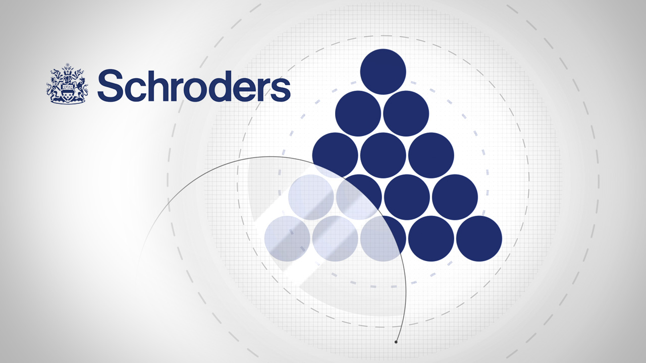
The animation phase brought the concept to life with a clean, modern design using Schroders’ blue brand palette, accented with vibrant orange for a fresh look. Abstract visuals helped simplify complex ideas, while smooth motion and transitions ensured clarity and engagement. Each frame was meticulously crafted to create a cohesive, professional animation that effectively communicated the Liquid Alternatives product.
The animation was seamlessly deployed on Schroders’ website, ensuring compatibility across all devices and browsers. Rigorous testing confirmed smooth playback, optimal loading speeds, and user accessibility. Feedback was monitored post-launch to ensure the animation effectively engaged financial advisors, delivering a clear understanding of the Liquid Alternatives product in an impactful way.
" The team have advised us that clients are watching the videos before they call, plus the phones are quieter, thank you!"